Product Design
Microsoft Exposure Management
Microsoft Exposure Management provides security teams end-to-end visibility of their organization’s security posture. It’s designed to give teams focus on key areas they should protect, reduce risk, and manage exposure.

Challenges
Confidently answering the question, “am I secure against X?” has become challenging to security teams. The UX approach for Exposure Management as whole was how to tackle a new concept of protection that puts focus first while keeping a simple at-a-glance posture view. Educating customers on a new protection conceptualization was the main struggle. This idea came from the following struggles customers expressed:
Confidently answering the question, “am I secure against X?” has become challenging to security teams. The UX approach for Exposure Management as whole was how to tackle a new concept of protection that puts focus first while keeping a simple at-a-glance posture view. Educating customers on a new protection conceptualization was the main struggle. This idea came from the following struggles customers expressed:
Fragmented VisibilitySecurity teams are constrained by siloed, incomplete attack surface views and experiences
Posture FatigueData overload from the tools without meaningful context prevent proper prioritization
Reactive Approach Operational team inefficiencies resulted from lack of comprehensive and focused view and slow work processes

Main product goals
Approach
- Information architecture is key - the most important information is placed where it makes sense, so users can zip around the platform without getting lost when keeping in mind the product overarching goal: allowing for protection visibility while offering customers to take action and reduce their risk.
- Constant transparency - ther organization’s “how am I doing” status is consistenly reflected across all pillars in the clearest way.
- User research - the platform was released in a very initial ‘Beta’ version, allowing me to collect feedback from customers at every step on the way while calloborating with the user research team to further investigate topics like onboarding, navigation, and score reflection.
- Customization - while offering the customers the idea that Microsoft knows best in terms of how to protect, it was also important for me to allow them to prioritize on their own, giving the essence that they know what’s best for their organization.
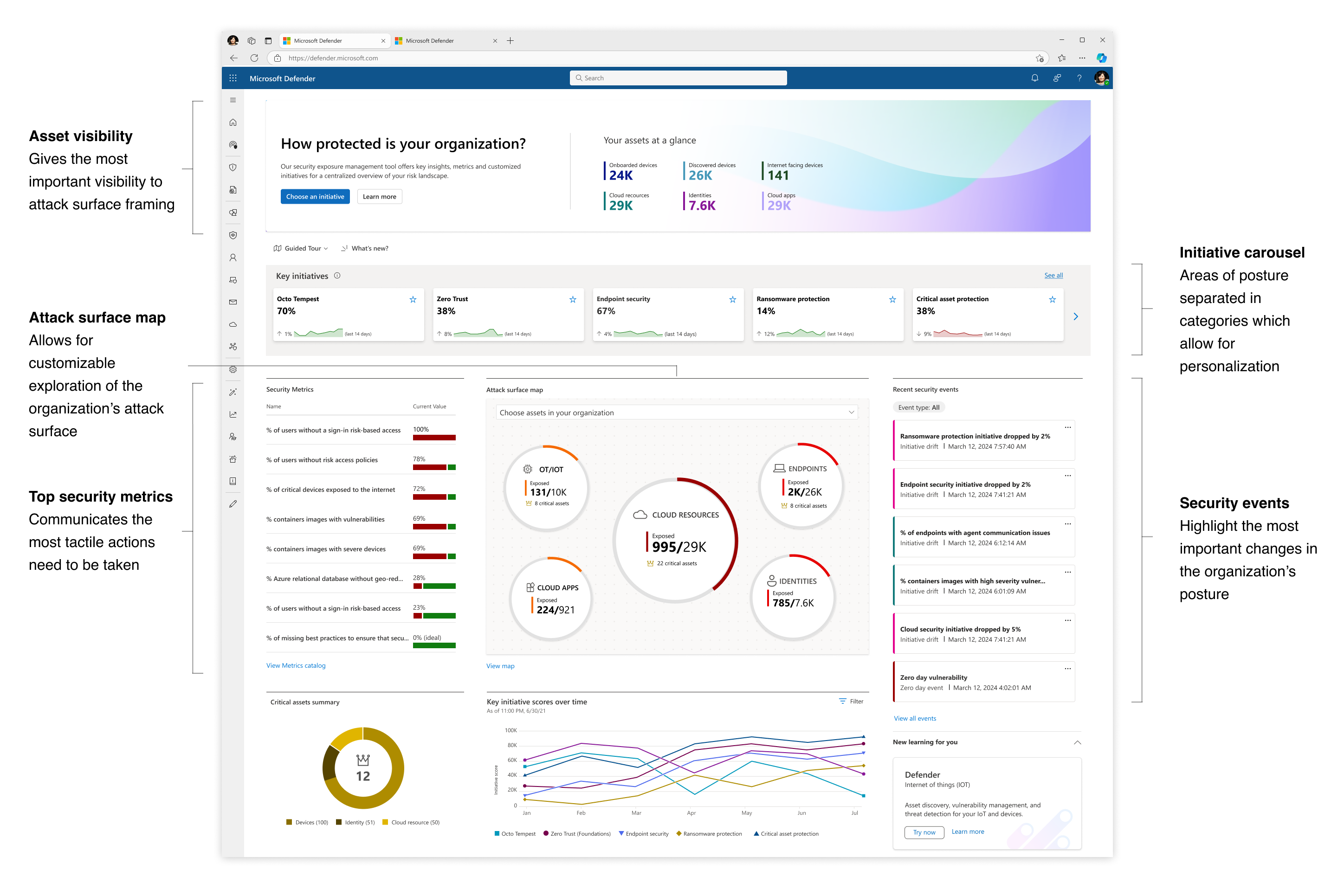 The initial Exposure Management dashboard released in Beta version
A new protection model: Exposure Management introduced new concepts into the posture framework, a challenge in itself to introduce to new customers:
︎ Initiative
A project or action plan addressing exposure and posture-related objectives in main areas of security organizations.
Examples:
Ransomware
Endpoint Security
Zero Trust
Examples:
Ransomware
Endpoint Security
Zero Trust
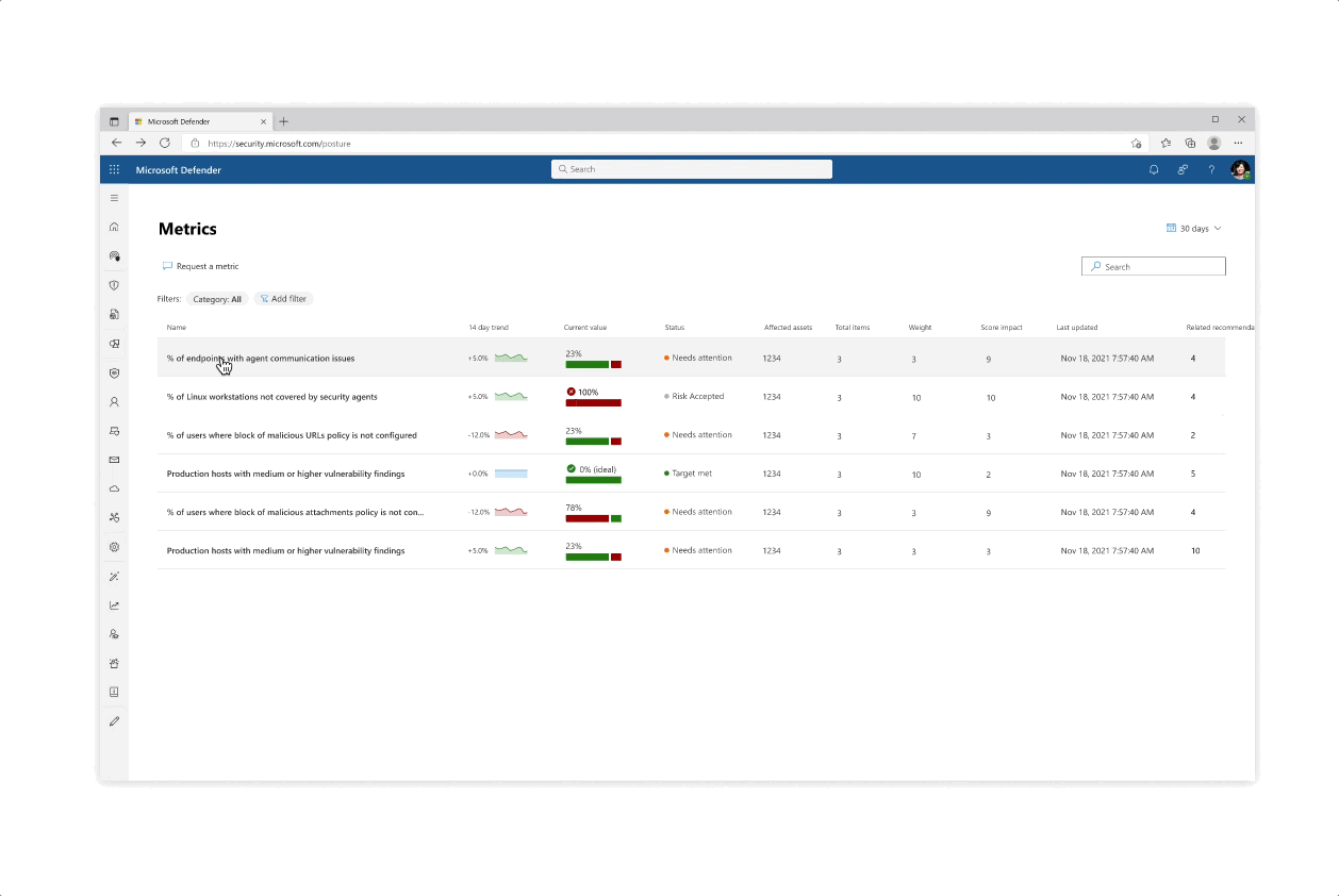
︎ MetricA measurement of a security-related process with an insight into the exposure status of the organization around a given topic.
Examples:
% of critical vulnerabilities
# of admin users without MFA enabled
% of servers running an unhealthy agent
Examples:
% of critical vulnerabilities
# of admin users without MFA enabled
% of servers running an unhealthy agent
︎ RecommendationA recommended action security practitioners can perform to address security gaps and improve Metrics status.
Examples:
Enable cloud-delivered protection
Turn on Microsoft Defender Antivirus
Require multi-factor authentication
Examples:
Enable cloud-delivered protection
Turn on Microsoft Defender Antivirus
Require multi-factor authentication

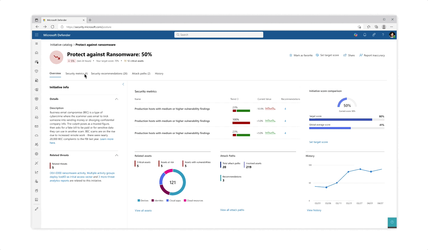
Design for the initiative and metric catalogs, as well as the initiative page
Challenge: Giving customers the right amount of focus
- The experience behind each initiative whether it’s reflected in the catalog or in the page is that the most important data is always prioritized, yet a focused deep dive of actions can be tajeb in inner click-throughs which are always linked back together to get the main area of focus
- Inner tabs at every step of the experience whether it’s in a side panel or page allow for bigger analysis of protective actions
- The initiative page gives an aggregated view of protective analysis with a focus on score at every step of the page
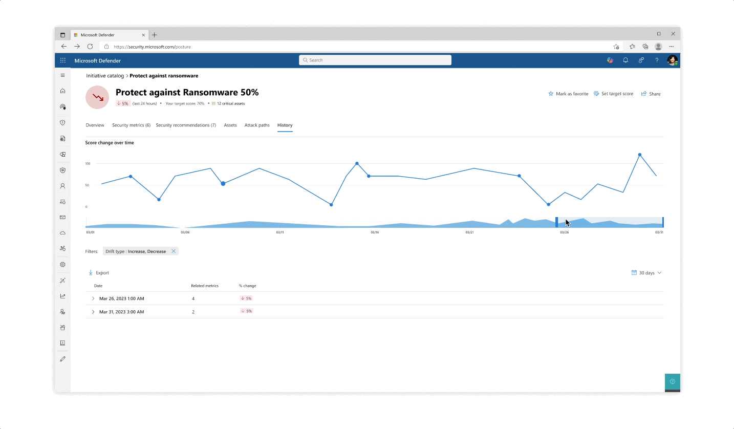
Challenge: understanding your score
- The various pill protection scores were obligatory to reflect as they communicate the organization’s posture status at every step of the way
- Beyond the score’s reflection, a main interest of users was why a specific score dropped and what possible actions they would take. The history tab of an initiative was designed so that users can get an holistic historical view but could also zoom in on specific areas and understand the reasoning behind changes.
- Another challenge that became evident is communicating the various metrics’ scores besides their customized target scores (as not every user wanted to put the same amount of work and focus into each pillar of protection).
 Design explorations for metric score representations
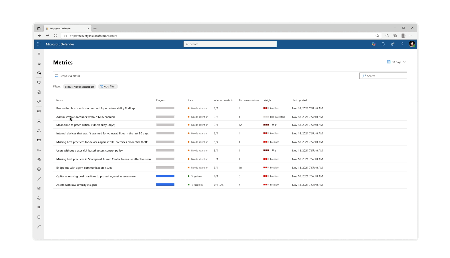
Solution: Trackable progress
- From confusing exposure scores, the approach was changed to make for trackable metrics, leaning in to more actionability across the product
- The metrics became a worktable tracking tool that allowed for analysts and team leaders to get a clearer protection state across specific and focused domains
Impact & Results
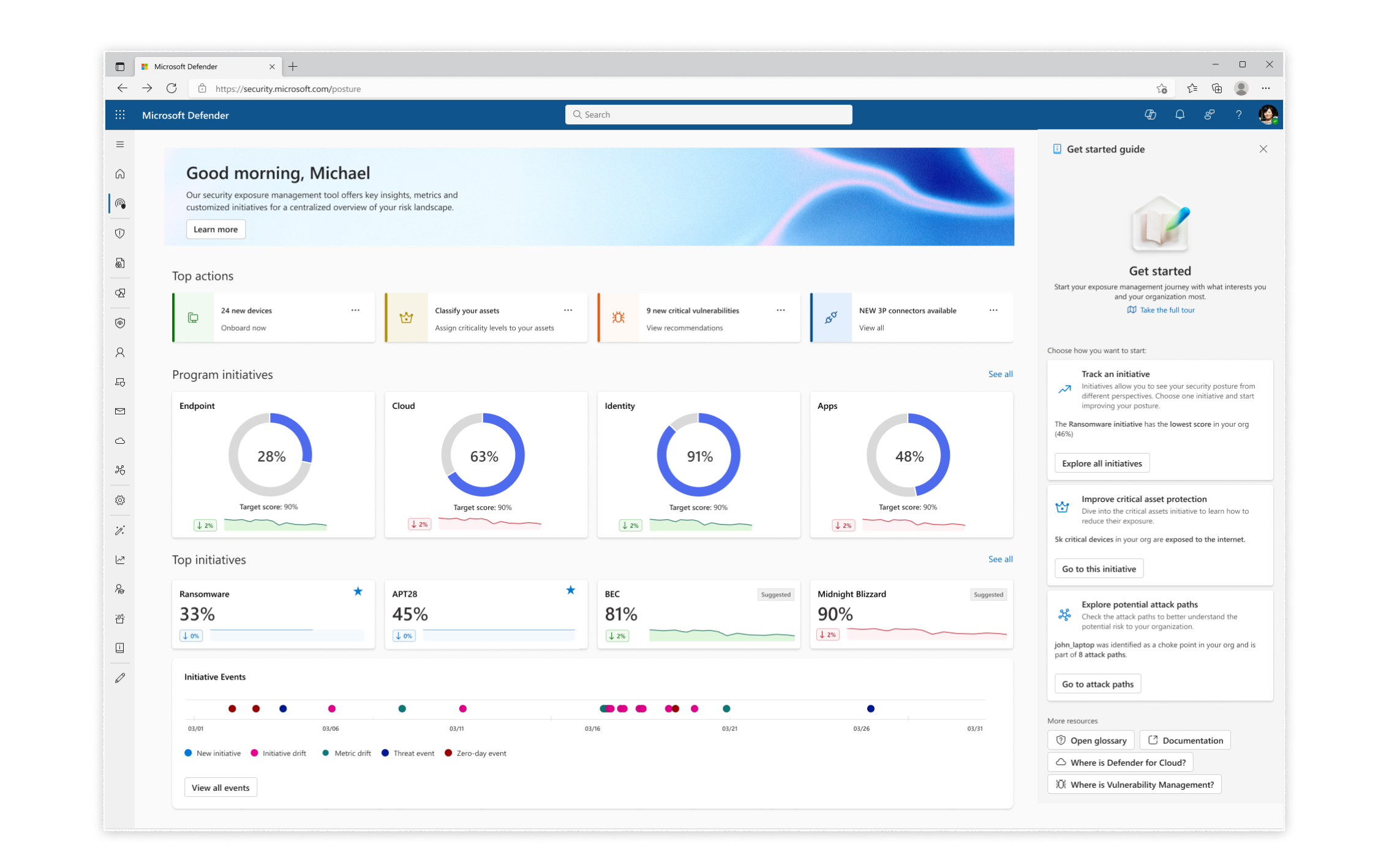
- I collected feedback from customer calls and user research in the ‘Beta’ version which kicked off a re-design for the new product dashboard that includes a more holistic tool for onboarding, immediate recommended actions, improvement of events design, and more focus on exposure.
- 80% of large customer tenants engaged with Microsoft Exposure Managements. 65% of all tenants actively participated
- New scoring UX showed 51% favoring new solution vs 42% of beta version in A/B testing
- Watch a full demonstration of the product (and don’t forget to look at the beloved comments!):